Here’s a thought that’s been nagging at me for the past few months: Over the last decade or so web design has become increasingly homogenous, attempting to ape the styles of other, older media and losing touch with what could make it new and unique.
First, let’s get this caveat out of the way: I’m not sure if the above statement is true. I don’t like to apologise in advance, but while my gut says it is true, and is annoyed and upset by what we’re losing, my head is more circumspect and wary. I may have missed something or confused the wood for the trees. I’m not a design guru. I don’t keep up with the hot design blogs. I haven’t been excited by a type catalogue for twenty years. But, possibly like you, I’ve been using and making websites most days for fifteen years. So there is, against all odds, a chance I’m correct, and the statement holds water; web designers are merely copying print design, and not being “web” enough.
Let’s step back a bit.
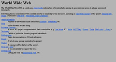 In the early 1990s websites were limited. There was almost no customisable design to speak of. Backgrounds were grey, text was black and a standard size, links were blue and underlined. There was little control over layout. But gradually things changed and the possibilities increased.
By the mid-90s there was more colour (216 of them!) and HTML tables allowed more complex page structures. It was possible to exert more control over a page’s appearance, to actually design it. Since then we’ve gained more fonts, more colours, better code, bigger screens, more bandwidth, more computing power, finer control over appearance. These days we’re starting to get access to a huge number of fonts and HTML and CSS keep improving and growing, year by year.
At any point in time, this process of improvement has seemed frustratingly slow, but in retrospect it’s amazing how much has changed, how many possibilities have been introduced in a relatively short amount of time. Web designers now have much, much more freedom than they did ten, fifteen, twenty years ago.
And yet, despite this freedom, it feels like web design is becoming more dull, not more adventurous. We’ve shaken off the restrictions of the early days, opened up all kinds of technical possibilities, but web design seems less exciting and less experimental than it did fifteen years ago.
There’s a chance this is purely nostalgia on my part. Of course things seemed exciting when the web was new and empty and we had no idea what was ahead. Despite myself, a little part of me does indeed want to go back to that, when being online felt more special. But that little part of me is misguided, in the same way that people who want to go back to the happy, simple “good old days” in the real world are misguided. Just as those people forget the diseases and hardship and lack of communication, education or civil rights in the “good old days”, the nostalgic part of me overlooks the early web’s lack of speed, services, information, friends, technologies, etc.
 But, looking beyond my nostalgia, I think there is something more. Web design has indeed become homogenised and less adventurous.
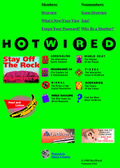
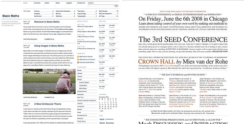
For example, I look at HotWired from 1995 and wonder what such a site could look like now if it had continued along the adventurous path it was setting out back then. These days all news and magazine style sites generally fit into the same broad template: Black text on a white background and a main column with one or two side columns. Big or small, they seem to aspire to a sense of tidy inoffensiveness.
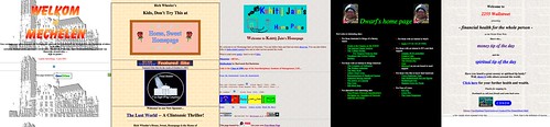
Personal sites, too, have become more dull. I’m not holding GeoCities up as a fine example of web design, but there was something special there, something “of the web”. Look at these examples picked at random. Yes, they sure are ugly, but they don’t look like objects that would have been created before the web. These days, most personal sites are neater, more structured, more akin to the aesthetics of conventional print design.
I don’t, by the way, wish to excuse myself from this decline in adventurousness. My own early personal websites were much more experimental than the current one, which was even inspired by the tidy design of a magazine. I’m very much at fault too.
I can see why this change happened, both to me and the web in general. There are several contributing reasons, including:
-
More rules. In the early days people were still deciding what worked and what didn’t. There was less accepted wisdom about how different kinds of websites should look, and you could try more things without them being “wrong”. The downside was that every site worked differently, and some of them badly.
-
More mainstreaming. These days every company is online in some fashion. The web has, on average, become more mainstream compared to the time when it was only the most adventurous who set up websites. It’s perhaps inevitable that, on average, web design is more dull, more mainstream. But it feels like even the kinds of people and organisations that would once have been among those early pioneers are settling for conventional design.
-
More automation. I almost forget that there was once a time before Blogger, before Movable Type, before Flickr, before any kind of automated tool that made online publishing easier. Back then, if you wanted to publish something on the web you had to write, or copy and paste, every page’s HTML. The growth of these automated tools and services is a very good thing, enabling people to focus on writing, taking photos, whatever they want to do. But this has meant that most people use standard templates of some kind, and these templates generally seem to follow conventional design rules of what looks nice and neat.
It’s easy to see why web design has become more homogenous, but it’s a great shame. It feels like we’ve lost the “webness” of web design over an incredibly short period. There’s something fundamental about the technology that lies behind all web design — right back to those old grey pages with their blue links — that perhaps should inform our contemporary designs. It feels like we’ve rushed through a hugely compressed process, discarding old design tropes all too quickly as new technologies enable new features and new fashions render old styles awkward. It’s as if Johannes Gutenberg went from printing his first primitive page in 1439 and by 1459 was already churning out full colour, embossed, foiled, pop-up picture books.
There was a time when the huge number of restrictions on web designers fostered greater creativity than is achieved now with fewer restrictions. Although we have vastly more possibilities open to us now, it feels like we’re trying to make web sites that adhere to an aesthetic developed over centuries of print, rather than finding something new from a couple of decades of the web. We had a blank slate in the 1990s, but it feels like we’ve given that up for aping print, whether modernist or more classical (both of which examples I love).
Maybe, I don’t know, Vimeo or Threadless or Flickr or whatever, do have something web-specific about their design which I’ve become so used to that I can no longer see it.
None of these unfairly-chosen examples are bad, but… If I was standing in 1995 and looking ahead to 2009 and was told how all of those technical restrictions would be lifted, of what would be technically possible, I’d imagine 2009’s web to look a lot more exciting than it does. I’d expect it to look less like a magazine or a newspaper and to look more like what the web could be.
Comments
Commenting is disabled on posts once they’re 30 days old.


antimega at 2 Dec 2009, 9:27pm. Permalink
I don't think its just aping print - it apes TV as well. Partly it is the rise of convention, as you noted, but that's multiplied by usability / user testing / Nielsenisation. I guess most experiments have been in Flash, but it's been a long while since I've seen anything mindblowing. I think the web app style is the newest (Google Mail was pretty revolutionary at the time). I do remember in the late 90s, loading Korean webpages, as they seemed so alien (due to the bandwidth difference). Now, all round the world, they tend to look the same.
Also, 'new media' art has pretty much disappeared too, or changed to just be a screen delivery system, rather than art for arts sake. Artists are now producing physical digital art, or generative work, rather than explicitly computer or browser-based.
It was because of this homogenisation that I made localondon 2d - just to try it. Whilst it may look like print, print always suffers from lack of space, something that things on the web shouldn't suffer from, but it's an attribute that's largely ignored.
russell at 2 Dec 2009, 11:16pm. Permalink
You've probably seen this: www.smashingmagazine.c…
I think it makes a similar point, but I haven't really read it properly because the design is all crazy. Whereas I did read yours - perhaps, partly, because of the simplicity of your design.
I know what you mean though. Maybe it's because so many websites are still designed for words. If it wasn't for the need to read maybe they'd escape more print conventions.
Personally, I'm getting fed up of all the maps and charts. There must be other ways to show data.
Jordan at 3 Dec 2009, 12:02am. Permalink
I’ll agree that web design tends to be more formal today, but I don’t see it as a bad thing. It does limit the full range of creativity, but the technology itself also imposes limits—it’s hard to do things on a very large physical scale; you can’t interact in the same ways as print; you can’t mix mediums the same way; etc. (It would be very difficult to execute that Letraset cover in a meaningful way on the web—splash page? content-below-the-fold?) There’s also advantages to the general consistency, as it means you can usually make useful assumptions about how to operate each new site you visit.
In the past most sites tended to have ‘that Geocities look’ because few people knew how to do anything beyond what their WYSIWYG editors could handle; these days most sites tend to have ‘that Web 2.0 look’ or ‘that print look’ or ‘that default blog theme’ look because most people still don’t know how to do anything beyond what their CMS can handle. But even in the print world, was it ever very different? The only real change is the lowered barriers to entry, for both creating content and creating design.
Not to say I don’t favor experimentation; I think there’s as much of it going on now as ever. It’s only in the past few years that grids have really taken off as a part of web design; AJAX, large-scale images and video, full typographic support, and so on are also relatively new even in the context of a twenty-year-old technology. I think that much of what you see as ossification could equally be seen as solved problems.
Regardless, you may be interested in ‘The Anti-web Manifesto’.
Ps: The title text for your ‘huge number of fonts’ link seems to have invaded the link itself.
Phil Gyford at 3 Dec 2009, 11:12am. Permalink
Antimega: Yes, I did rather ignore Flash, partly because -- rightly or wrongly -- I rarely think of it as "web" design. Interesting point about web apps -- maybe more rich, interactive (ouch, nasty words) sites will encourage designers to ape print less. Although yes, maybe they'll just look more to TV for whizziness.
I wondered about "net.art" but have never really known much about it. I guess there was something more impressive about the good stuff when it had to try so hard to do interesting things with very limited tools. These days so much more is possible, so there are fewer restrictions to fight against.
Russell: I hadn't seen that post, but it's very interesting, ta. I can't see many people designing everything they write bespoke and, unlike that author, I don't see anything wrong with writing brief templated blog posts -- that's half the fun, doing something quickly isn't it. It would be nice to see companies with more resources doing more interesting bespoke designs though...
Jordan: I'm not quite sure whether you're agreeing or disagreeing with me, but thanks for your thoughts, and the correction. :) Regarding your last point -- yes, some of those things are "experimentation", but many of them (grids, more fonts) feel like experimentation in aid of being able to make sites look more like how a print designer would want them.
Paul Mison at 3 Dec 2009, 12:06pm. Permalink
I might have been listening to that Dan Catt too much, but it seems web design isn't like print design at all. Print, even with its tight deadlines (incredibly so, for newspapers) seems to have a lot of freedom to mess around with layouts, whereas most web layouts these days are blocky and regimented. If you're very lucky your CMS will let you switch on or off sidebar elements, or have a special template for displaying lots of images, but even that's somewhat rare.
Being a bit of a technological determinist, I put the blame for that mostly in what you label "more automation": almost all web content now comes out of a database, since writing individual pages by hand (as suggested in the "blogazine" post that Russell mentioned before I could) is far too much like hard work.
I'd also suggest (at the risk, perhaps, a seem to be a bit of a fanboy) that Flickr does have good web-native design. When looking at a photo, I can look at other images by that user, other photos in any pools it's in, photos with the same tag (globally or per-user), and so much more. Sure, none of that stuff is particularly leaping up and down at you, but it's all there if you know what to look for, and it's deeply, deeply embedded in the site, allowing you to look around at everything there in a way that physical magazines - or exhibitions - can't match.
gavinbell.com at 3 Dec 2009, 12:10pm. Permalink
I struggled with exactly this issue in the design chapter of my book. What is it that makes flickr etc different to the rest of the web? I came to the conclusion it was about the inclusion of others' content, making a template not a page. Whereas a news paper website or even a blog is designed by one person and they tend to be employed by the paper or write the content.
Maybe it is a natural phenomenon, Victorian handbills where the geocities of their day, giving way to a formalized and slightly more rule bound approach.
@antimega I think some of the new media creativity has gone into places like the arduino or similar hardware hacking, it is starting to head into genetic manipulation too.
Phil Gyford at 3 Dec 2009, 12:27pm. Permalink
Paul, Gavin: I think we're in danger of confusing design in a broad sense -- including IA, interaction design, etc -- and a narrower graphic design sense, which is what I was (perhaps too vaguely) getting at here. All websites are more web than print if we look at their links, content, etc... but, much as I love Flickr's graphic design, it's still black text, white background, one big column, one small...
Josh at 3 Dec 2009, 3:37pm. Permalink
Soo... You'd rather have dancing gifs all over the page? Or, instead of dancing gifs, flash movies? Or maybe even some CSS3 transitions? I understand what you're saying about lifted restrictions, but there's only so much you can do and still have a tasteful website.
Cait at 3 Dec 2009, 3:39pm. Permalink
I remember having exactly this conversation when blog CMS's first started, and Justin Hall's site, instead of being a total delight of a sprawling mess of different page designs depending on his mood / age at the time became a formal day by day thing just like everyone else's and it made me really sad. Prior to that, the pasrt of his personality that had been unstructured, and non-formal was given free reign.
I remember at the time, barely anyone except Nick Sweeney agreed with me!
My earliest hand coded iteration sadly looks so much like a Wordpress template I'm quite horrified by how unimaginative it is: http://www.zoonies.com/cait/diary/dailymay98.html.
I'd forgotten your 1998 one. It's excellent!
Phil Gyford at 3 Dec 2009, 3:48pm. Permalink
Josh: If you were to take what I wrote purely superficially then yes, I would love everything on the web to be centered text with animated gifs and MIDI background music playing. No, of course that's not what I want. I think what I'm objecting to is that aiming for "a tasteful website" all of the time is very, very dull.
Cait: Yes, there's something nice about old web pages staying looking the same, even as newer parts of it get spruced up. I remember when BBC News got a new look and I thought it was rubbish that they didn't change all the old pages to look the same... I was wrong, because now I love that you can recognise really old stories by the design.
Matt at 7 Dec 2009, 8:22pm. Permalink
I wonder if the problem is now too few constraints to force us to think creatively. If you have only 640x480 pixels and a web-safe colour palette to play with you have to work hard to stand out. Now it's so easy to implement the first idea that there's less chance of a second or third idea emerging, unless you consciously enforce iteration. But that's why mobile is so exciting. If you can make a site that works well in QVGA, piortrait and landscape, for a user with two minutes to spare on a crowded street corner, then your legacy version for tethered screens will probably make an impact too.
Ben at 28 Jun 2010, 3:24am. Permalink
You've made a lot of good points, and it's true that web design nowadays seems to steer along a very homogenous path. However, I'm not sure if that's entirely a bad thing. If you need to communicate quickly and easily with your readers, what better way to do it than with a clean, plain design? Think about it this way: print design has had thousands of years to develop. The reasons why it has developed the way it has are rooted in the ability to communicate a publication's main ideas to a reader with ease.
Perhaps it doesn't feel as new and unique as it used to. But if a website's primary purpose is to be informative, rather than aesthetically pleasing, wouldn't having an greatly interesting design distract from that purpose? And just like in print (e.g. the Letraset book you linked to) you'll have a number of websites that have interesting and unique designs as well. They just won't be popular or mainstream websites, because their purpose will be to cater to people interested in design.
Emyr Tabrizi at 8 Jul 2010, 3:18pm. Permalink
I fully agree with you. I think the web has become very boring.
Gone are the days when i used to get excited about cool designer sites
with crazy web animations and techniques. Nowadays its all about kerned type and how minimal a site looks.... BORING!!
The web needs to take some drugs and juice up on some creativity!