Writing
Wednesday 1 June 2005


 Nice chart of my MP3s over time
I’m fairly obsessive about the metadata on my MP3s and I do my best to fill in the Year of each track. 9,989 of my 12,217 tracks have a Year set, so there’s still room for improvement. I wanted to see what the distribution of my music looked like over the past century and in the absence of iTunes being able to draw pretty graphs (all that data; surely Apple’s missing a trick here) I did one in Excel:
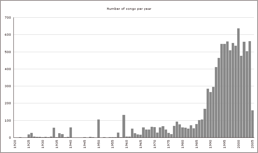
(Click for a larger version.) I wasn’t sure what to expect, so I’m not sure this is surprising in any way, but I feel that tiny bit happier knowing the shape of my music. Older music is probably under-represented here, as it’s harder to pin down the year of random tracks from, say, the 1960s.
The peak in 1934 is down to albums of Cajun and Creole music and Black Texicans. 1940 and 1950 are both due to what I now realise is the improperly dated Complete Hank Williams. 1959 is filled with a few compliation albums that probably also have incorrectly dated tracks. Obviously I’m not obsessive enough and this was even more of a waste of time than I’d expected. MusicBrainz doesn’t seem to include individual track years in its data… does anywhere else?
If you want to create a similar chart for your music here are my instructions for people who are as clueless about how to use Excel as I am:
- Open a new spreadhseet in Excel. In cell A1 enter “Song name”, in B1 enter “Year”. In D1 enter “Year” and in D2 enter “Number of songs”.
- In iTunes create a Smart Playlist matching both these conditions: “Year is not 0” and “Year is less than 3000”.
- In the View Options (Cmd-J) unselect everything except “Year”. (Tip: If you hold down the Option key when you click a checkbox, they’ll all toggle on or off.)
- In iTunes, select all the songs in your playlist and Copy them to the clipboard.
- In Excel put the cursor in cell A2 and Paste the song list in.
- In cell D2 type in the earliest year from which you have a song. In D3 type the next consecutive year (whether you have a song in it or not).
- Select both D2 and D3 and drag downwards and Excel should do its magic thing and fill in the next consecutive years as far as you drag. Stopping when you get to this year is probably what you want to do.
In cell E2 enter this formula:
=COUNTIF($B:$B,"=" & D2)
- Select cell E2 and drag downwards so that Excel fills all the cells beneath with the appropriate variation on the formula.
- Select the contents of column E, from row 1 down to the final row you have data in (mine’s row 85).
- Click the Chart Wizard icon in the toolbar.
- In the window that comes up hit the “Next >” button and then the “Series” tab in the next pane.
- Click in the space for the “Category (X) axis labels”. On your spreadsheet drag to select all the years in column D from row 2 down to the final one (row 85 for me).
- You can now click the “Finish” button or “Next >” if you want to fiddle about with how the chart will look (although you can do that later by right-clicking on different parts of the graph).
- To extract the chart as a gif, the least painful way seems to be to “Save as Web Page” and then use the gif file that generates.
Comments
Ah, so statistically you think that the music is better under the Conservatives. TBut that must be 4 weeks of continuous music tracks you have there - does it mean that you will have music there that you'll never listen to again?
There are some tracks I've rated low so that I'll hopefully never hear them again, but I'm sure most others will come round in random play at some point...
Commenting is disabled on posts once they’re 30 days old.