Guardian Daily Edition app review
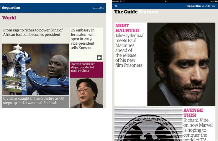
On 17 October the Guardian released a big update to its Guardian Daily app – which displays the content of the day’s newspaper – the first dramatic redesign since its launch around October 2011 (I can’t find an exact date).
The original app was once available for iPad, Kindle Fire and Android tablets but since January 2018 has only been available on iPad. The new version now works on iPads, iPhones (on the App Store) and Android devices (on the Google Play store).
Back in 2010 I created my own online edition of the day’s Guardian/Observer (which is still running) and wrote a post about how I approached the design, and what I thought was unique and important about “a day’s worth of news” compared to a standard, contantly-updating, news website or app.
I’ve been reading the “paper” with the Guardian Daily Edition app every day since its launch, only occasionally using my own website; while I’m still pleased with my site the iPad app offered a smoother experience with more pictures.
For the past fortnight I’ve been using the new version of the Guardian’s app and these are my thoughts on the changes. I’ve continued to only use it on an iPad Air 2; other devices might have their own positive and negative points but I wanted to focus on the changes from the previous version.

The biggest change is in how the sections and articles are structured in relation to each other, and I’ll look at that and the major interface changes first, for the old app then the new app. Next I’ll discuss some other changes in this version, before listing some smaller points that might be not-yet-fixed bugs. Finally I’ll summarise everything.
I wondered if there was any other coverage of the update but, aside from the Guardian’s own press release, all I noticed was a bunch of launch-day re-hashes of that and/or other quotes from Guardian staff: Creative Review, Design Week, It’s Nice That, Press Gazette, Digiday, and In Publishing. I was disappointed to be honest. I had hoped there would be more analysis and critical thought but none of these give the impression they’ve even seen the app. I guess this is the state of design and media journalism, and if you want thoughtful (or not) critique you’re stuck with tweets and app store reviews.
One further note: I didn’t grab any screenshots of the previous version of the app before I upgraded so I’m using the best I can scavenge via Google Images and my old tweets. They may not represent how the previous version looked most recently.
§ Changes in structure
Although the content of the two versions of the app (which I’ll refer to as the “old” and “new” apps for simplicity) is much the same – roughly the contents of that day’s newspaper – the way in which it’s structured, and how the reader navigates through it, is quite different.
I’m going to compare the structures of the two apps with some diagrams.
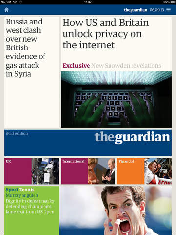
The old app
(I hope I have the description of the old app’s structure and interactions correct; I’m writing this from memory now the old app has been replaced.)
The foundational element of both apps is, of course, an individual article:

You read one article at a time and could swipe sideways to move from one to another, in order. We can represent the articles in the old app with these thumbnails, indicating the articles, which generally stretched off the bottom of the iPad screen, like web pages:

This is simplified for clarity – we have only three different sections, indicated by colour, (like National news, Financial news, Sport, etc) with only four articles in each. The reader could go to the next article and back again. They could work their way one article at a time from the very first article to the very last. Just like on my Today’s Guardian website in fact.
Omitted here are links that were in the articles’ sidebars. These included links to the next and previous article, and “related links” which could take you to other articles in this issue, or older articles on the Guardian website (I think; I never used them).
If we go “up” a level from the articles, the old app had a separate page for each section that linked to most of the articles within it, using images and coloured text blocks:
The reader could tap one of the blocks to read the associated article. The section page might stretch off the bottom of the screen if it was large, but I think it was rarely more than a couple of screens in height.
Here I’ve added section pages for each of our three simplified sections to the diagram:

I think I remember correctly that you could swipe left/right to navigate from one section page to another, as indicated here. Every article could be “closed” by tapping an × icon at the top-left of the screen, which would reveal its section page.
One downside of the old app was that these section pages didn’t necessarily show every article within the section. For example, in the Saturday ‘Weekend’ section, there might be a ‘Body & Mind’ block linking to the ‘This column will change your life’ article and you’d then use the sidebar links on that article’s page to get to the two or three other articles within that subsection. I don’t think this was often done outside of the Saturday edition, but it was hard to tell. I assume it was a design decision – not wanting to make the section pages too long – rather than a technical constraint.
We can go up one more level, above the section pages, to the front page of that day’s edition:
This was similar to the section pages in functionality but linked directly to articles across the entire newspaper. I’ve added this to our diagram:

Also, at the top-right of every page was a link to open a drop-down menu, which contained links direct to each section page, to allow skipping around. We can add this to our diagram of the old app to complete it:

There’s technically a further level “up”, displaying the front pages for each day’s edition, which I’ve omitted here, as I’m focusing on the experience within a single day’s edition.
All those arrows makes this look a little complicated but the reading experience was pretty simple. A typical weekday reading for me would be:
- Tap the “first” article on the front page (not always obvious, but usually top-left).
- Swipe sideways through each article in turn until I get to the ‘Journal’ section, where I don’t want to read all the opinion pieces.
- Close the article to view the ‘Journal’ section page.
- On that tap the Letters block and swipe sideways through them and the obituaries.
- Open the drop-down menu to select the two lifestyle/arts section at the end and dip in and out of anything that’s interesting there.
It was easy to swipe through consecutive articles as far as one wanted and easy to scan the contents of each section; a section page was generally one or two screens tall, so it was quick to see what was within. And it was easy to jump from one section contents page to another, either swiping sideways or using the drop-down menu.
§ The new app
I’m going to look at the structure of the new app in a similar way but, because it’s a little harder to describe, and because I have the new app available, it might help to see a quick (silent) video of the new app in use:
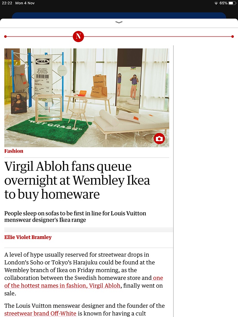
OK, let’s look at the new app’s structure starting, as before, with the articles. Ignoring graphic design changes, and some other interaction details I’ll come to later, an article page looks broadly the same as in the old app except it no longer has the sidebar links:
Losing the sidebar links makes sense to me. The next/previous links in the old app replicated the swiping action and, eight years on, I think we can cope with discovering that interaction. I’m guessing that, like me, few people used the “related links” and so they were dropped. Now the article looks simpler.
So, our article-level diagram looks broadly the same for the new app:

But! There is a small difference here: there are no lines joining articles in different sections (between red and blue, and blue and purple in this diagram). If you get to the final article in a section it’s no longer possible to continue swiping to get to the first article in the next section. You must now close the current article in order to go “up” one level, navigate to the next section, and select an article within it to continue reading. A few times every day I end up swiping a few times to go the next article, wondering why it’s not moving, only to realise I’m at the end of a section.
In the old app we had two levels above the articles: section pages and a front page.
In the new app there’s a single level above – which I’m calling the “sections canvas” – which is a vast space containing links to every article in this edition, and is therefore difficult to capture in a single screenshot:
Each section on the canvas is a long horizontal row of screen-sized blocks (like the block shown here), linking to articles, that stretches off to the right of the screen. And the sections are positioned vertically, one above the other, stretching down off the screen. In our very simplified diagram it looks something like this:

All those connection lines make this look more complicated than it is… in essence, every block in the section rows links to a single article.
A good thing about this is that every article is represented on the sections canvas, unlike in the old app’s section pages where some articles were omitted. However, it’s not quite a one-to-one mapping: the top row isn’t a section but a ‘Top stories’ row, which contains links to maybe half-a-dozen articles. Some of these are only linked to from here, while others are also linked to within their own section row further down. There’s no way to tell which is which.
Unfortunately, this is only a minor drawback compared to the other flaws with the sections canvas. Navigating this vast space requires a lot of swiping. For example, the edition for Saturday 2nd November had 13 sections, one row each, each of which is one screen high. So that’s 12 swipes to scan down through all sections, although that will only show you the first screen’s worth of each row, generally showing a single article.
Each section row contains up to 15 screens’ worth of blocks, arranged horizontally, with each block containing 1-6 links to individual articles. That’s a lot swiping to see what’s in one section, without even reading an article. In this Saturday edition I counted 80 iPad screens’ worth of link blocks to be navigated, should you want to get an overview of that edition.
The problem is that the scales between the two levels – sections and articles – aren’t different enough. A contents listing needs to be much more “zoomed out” than the things it’s linking to (the articles). Otherwise you’re losing some of the benefit of even having a contents page. That ’Life’ section contains 29 articles but its contents row takes up 15 screens. It requires half as much work to get an overview of the section as it would to flip through every article individually. It’s as if the contents list of a 290-page book took up a further 150 pages.
To summarise the problems with this structure:
-
The sections canvas is way too big, requiring too many swipes to see it all. It should be a way to quickly see what’s inside or to find a specific article.
-
Scrolling up/down and left/right across a large canvas is, in theory, a nice idea – everything is laid out in a logical structure – but, in practice, having to scroll in two directions makes it feel too complicated.
-
Not being able to swipe between the last article in one section and the first in the next compounds the pain, because there’s no escaping the unwieldy sections canvas.
-
It’s confusing to have some articles only appear in ‘Top stories’ and some appear there as well as in their own section.
And the solutions? I’m tempted to say this method of displaying the contents needs entirely rethinking, or reverting to the old, more navigable, structure of one slightly-scrolling page per section. If that’s not possible, this would probably make the best of things:
-
Drastically reduce the amount of space each article is given on the sections canvas. If each screen-size block contained its maximum of 6 article links, those 29 articles could fit in 5 screens, rather than 15. Not ideal, and more than the previous design, but an improvement. Shorter sections could fit in one, two or three screens.
-
Add back the ability to swipe from the last article in one section and the first in the next. Having to close a section’s final article, scroll the sections canvas down to the next section, and enter it, is unnecessary friction. It should be as easy as turning the page of a newspaper, as it was before.
-
Get rid of the ‘Top stories’ row, which is a little confusing and would save much-needed space. If it must be kept, articles in that row should only live there, not also in another section.
§ Other changes
As well as the fundamental structural changes described above there are a lot of others, large and small, that are rarely for the better which I’ll cover here. Some might be things not yet addressed in the pressure of a relaunch, while some are conscious design decisions.
-
When reading an article there’s a progress bar at the top to show how far you are through the current section. It has two problems. First, it displays only the section’s initial letter which isn’t always meaningful unless you’re intimately familiar with the Guardian’s structure (plus some sections share initial letters). Second, although you can tell that you’re, say, about one-third of the way through a section, there’s no indication of how many articles are in the section. Have you read one article and have two to go? Or read ten articles and have 20 to go? Who knows!
-
While reading an article there’s no indication of what day’s newspaper you’re reading.
-
Both of the above issues mean that an article feels oddly unmoored from its context. The old app displayed the name of the current section, the edition’s date, and the number of the article within the section (e.g. “10/29”). You knew where and when you were at all times.
-
To close an article, and return to the sections canvas, you must tap a small down-arrow at the centre of the top of the screen. This is an awkward position, and it also makes little sense as a navigational element. It’s the kind of interaction usually used for a panel that slides up from the bottom of the screen, which isn’t how an article appears. The old app’s ×-style “close” button maybe makes more sense.
-
When you do close an article you’re returned to the sections canvas in the position it was in when you last opened an article. So if you open an article on the sections canvas, swipe sideways through several more articles, then close that article… you’re back at the sections canvas displaying the first article you clicked on. You have now lost your place.
-
As with the old app, most articles start with a photo. But, while the caption used to be visible, it’s now hidden and requires a tap on a camera icon to display it. This is frustrating, especially when you want to both read the caption and see the image, for example when the caption contains a list of people in the photo. It’s an unnecessary extra action that adds another small piece of friction to the reading experience.

-
There’s no longer a “share” button on each article. In the old app it was often unpredictable as to whether this would appear and, even when it did, it was frustrating when one wanted to get the URL of the article on the website; it would also put the name of the article on the clipboard. But at least it was, often, there. In the new app there’s never a way of getting from an article in the app to the same article on the website, never mind sharing it in any other way.
-
In the old app the sections were generally named after the sections in the print newspaper. On weekdays there were the small one-off sections (Education, Society, etc). And the Saturday edition featured Weekend, Review, The Guide, etc. This has changed now. The one-off weekday sections are absorbed in the end of the National news. And other non-news sections have been reorganised and retitled. I can see this might make sense long-term, particularly if there are plans to make the contents of the app and the newspaper diverge. But it’s currently disorientating and feels odd, when I’m still think of it as “the iPad version of the paper”. There is no longer a shared language between Guardian app readers and Guardian newspaper readers.
-
As well as swiping articles left and right to navigate between them, it used to be possible to tap the left and right edges instead, which was often easier. This no longer works, although maybe newer devices than mine, with smaller bevels, would make this problematic? Too easy to accidentally touch the edge of the screen while holding the device? A shame, but fair enough if so.

- The old app required each edition to be downloaded in its entirety before it could be read. This was a pain on a slow connection but otherwise rarely took long and at least you “had” that edition then, available offline. I no longer understand how this works. I don’t think it needs to be downloaded first, which is good. But I think it can be downloaded, but I don’t know when that happens. There’s a menu listing the editions you have available to read, with icons indicating whether they’re downloaded or not but I’ve no idea why, on mine, some are downloaded and some aren’t, or how to download them (tapping an icon does nothing).

- The old app had a page showing the national weather forecast plus, I think, some other related pages (I never looked at them, so can’t be sure). This was like the forecast in the newspaper. The new app no longer has this, but has a brief forecast for the next ten hours, with five sets of icons, temperatures and times. It’s always on the edge of the screen when browsing the sections canvas, which feels a bit odd. Weirdly persistently prominent. And if you’re reading a previous day’s newspaper the forecast is still for the next ten hours, despite the previous day’s date being at the top of the page. And who knows whether this is the forecast for the country as a whole, the reader’s location, or somewhere else.
§ Some bugs (perhaps)
In addition to the above there are several other small issues that I assume are either bugs that will be fixed (there’s been one update to the new app so far) or things that didn’t quite make the cut for the release date:

-
Every time the app opens afresh it asks me to choose my privacy settings. This is probably made worse by iOS 13.2’s reported tendency to kill background apps more aggressively, but it’s still frustrating.
-
The app often doesn’t open where I left it, presenting me with the top of the current day’s edition. This happens every time if I leave the app while looking at a day’s sections canvas, and sometimes if I’m viewing an article. Even if I was reading a previous day’s edition, if I leave the app and return, I’m taken to the current day’s sections canvas. Given the labours involved with navigating to a specific article, this gets very annoying.
-
Aside from the problems with the sections canvas size, scrolling it is pretty jerky. Up/down is a bit clunky in general, while left/right has an… extra… jerk… at the end of every swipe.
-
While viewing the sections canvas, if you reorient the device from portrait to landscape, or vice versa, you’re jumped to the top left of the canvas yet again. If you reorient the device while reading an article, behind it, secretly, the sections canvas has jumped to the top left. Surprise!
-
If you reorient the device while reading an article the entire page goes blank for a moment and… then… redraws… itself like a webpage. Maybe this isn’t noticeable on faster devices?
-
On the sections canvas every row of blocks has a progress bar above it to show how far along you currently are. These often stretch off the right of the screen.
-
There’s no indication anywhere of who set the crosswords, either in the sections canvas or when viewing a crossword.
-
The “Check this” button under a crossword, for checking whether a word is correct, doesn’t give much feedback. It used to tell you whether your guess was correct or not. Now it simply removes any incorrect letters, leaving the rest. At first this was confusing because, if you’ve got the word correct, there’s no feedback at all. And if you’ve got the word partly correct it feels more like cheating to have it only remove the letters you’ve got wrong.
§ Summary
I’m sad that the new app has made everything a little bit worse. I wanted to wait a couple of weeks before writing this because I didn’t want to be all, “I hate this new thing! Make it like the old thing!” An inevitable reaction to any change, good or bad, as anyone who’s run a website, service or app knows.
But unfortunately the new app’s changes make the reading experience more of a chore than they used to be. I can imagine the old app, which had been around for a while, may have been ripe for a rewrite – who knows what horrors its code contained by now – especially to have it work on more devices again. But in doing so design changes have been introduced that have added friction to an experience that should be as friction-free as possible.
The two-dimensional sections canvas is a logical idea – I can imagine coming up with it myself when thinking about ways to arrange the structure. But in implementation it’s unwieldy and disorientating. It gives the reader a very small window onto a vast space that – even if the jerkiness and the various smaller navigational oddities were fixed – is an effort to navigate. Want to find that article you read this morning? You have a whole lot of swiping to do, left and right, up and down, left and right again…
The articles of the “newspaper” are the heart of the app. If the swiping between the last article in one section and the first in the next was fixed, plus the various smaller issues mentioned above, the basic reading experience would be as simple and friction-free as it was before.
That would leave the sections canvas needing some serious re-working, because at the moment it is getting in the way of reading. I find myself having second thoughts about “starting work” on reading the Guardian now because I know it will require a level of effort and frustration that is new and unnecessary.
To bring some perspective, this isn’t an awful app or a terrible upgrade. It’s not difficult to read the day’s news using the new app. But “it could be worse” isn’t a great state to be in. Reading the Guardian with this app is harder than it needs to be, and harder than it was. It’s a shame that what was about as simple an experience as possible has been altered to introduce more points of friction, more work, and more rough edges. It often feels like change for the sake of it, and change for the worse.