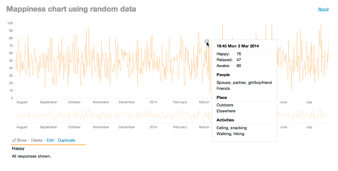
Mappiness is a free iPhone app that helps you manually track your happiness, relaxedness and awakeness in different situations over time. I’ve made a tool that helps users examine their data more closely (or you can try it out with random data).
The Mappiness app itself shows a series of graphs of your data but these don’t allow for detailed analysis of the data. And, once you’ve been using the app for a long time, there’s too much data to see clearly on phone-sized charts. However, the app gives each user a code that allows them to download their data in a variety of formats from the web, so I decided, as another exercise in using D3.js, to make my own chart.
If you use Mappiness you can enter your personal code and, if you’re patient, your data will be downloaded and displayed. Alternatively, if you just want to see what the chart looks like, it can generate some semi-random data to play with. (The data isn’t entirely random, but tries to emulate a possibly-believable person.)
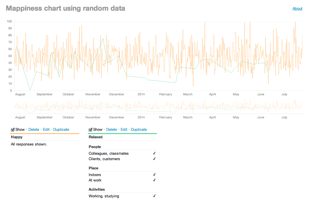
You can duplicate lines and edit them, to change either what’s displayed (happiness, relaxedness or awakeness) or the criteria used to choose which points are shown. This is based on the data entered with each response in the app, and lets you filter by the people you were with, the kind of location (e.g., indoors, at work, etc.), the activities you were doing at the time, and any text notes added:
To see more detail in the large chart, you can use the small “brush” or “scrubber” chart below to select a region to zoom into. Very useful when you’ve accumulated a lot of data; this chart shows a year’s worth of data, but I have nearly four.

The screen to edit a line’s criteria hopefully makes some sense to people who are familiar with Mappiness — all the terms used are identical to those in the app. But even so, as simple and clear as I tried to make it, I’m sure it’s a little baffling:

But still, this does provide for much, much more fine-grained analysis of one’s data, which is surely the point of “life-logging” tools like Mappiness. There’s no point collecting all this data without reflecting on it in aggregate. Am I more happy at work or home or elsewhere? When listening to music or not? Do I actually enjoy watching TV?
Of course, we have to be careful not to confuse cause and effect — maybe I only watch TV when I’m fed up, rather than TV making me fed up. And the fact that one of my most happy-making activities is apparently drinking alcohol is more a factor of the occasions in which I do it: when chatting with friends.
So, if you use Mappiness, or are just intrigued, give it a whirl.
Commenting is disabled on posts once they’re 30 days old.