Here’s one thing that’s making me angry at the moment. In fact there are several things making me angry at the moment: McCain’s supporters; the greed that lead us into these financial end-times… and by comparison this particular matter is trivial. But at least it’s easier to solve than the others.
This particular annoyance is the graphs of share prices in the press and on TV. It is standard practice to start the y-axis at a number much higher than zero, in order to magnify the ups and downs of the market. Here’s one from today’s Guardian, showing the FTSE 100 over the course of Friday:
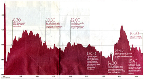
Dramatic isn’t it?
(Let’s quietly pass over the caption for this which, for unknown reasons, read “Averaged by age group, pounds per week.”)
We can see every little peak and trough. But it also looks as though by 14:30 the average was around one-fifth of the opening price — stocks had lost 80% of their value! Of course, they hadn’t. In reality they’d “only” lost around 9% of their value. Unless one is going to examine the y-axis and mentally imagine the bottom of the graph (which, in this case, would have extended off the bottom of the page by nearly a metre) the graph completely misrepresents the day’s activity. It lies.
(I’m using the Guardian as an example because I have it to hand but most, if not all, similar graphs suffer from similar design these days.)
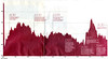
Let’s have a look at what a graph using the same space would look like if the y-axis started at zero:

Now we have a clearer idea of what was at stake. We can see at a glance the kinds of losses and gains in proportion to the FTSE’s actual value.
This correct graph does have its down sides. If one is interested in the details they get lost when the rises and falls are compressed so much. Plus, to those unfamiliar with the stock market, like me, this graph doesn’t look particularly alarming. Apart from that steep fall just after opening I wouldn’t have realised this was a dramatic day. So it could be argued that dramatising the day by magnification conveys the real import.
But it is also fundamentally misleading. The best solution would be a combination of both graphs — one to show the overall picture, in proportion, with a zero-based y-axis, and one magnified to show the details. Otherwise, and especially when those exaggerated graphs are the only ones we ever see, we will never gain a good understanding of what market behaviour is and isn’t normal.
UPDATE: I’ve written a bit more about this and added some more examples of graphs. 16th October 2008.
Comments
Commenting is disabled on posts once they’re 30 days old.
Matthew at 11 Oct 2008, 11:00pm. Permalink
The FTSE 100 began at a base value of 1000, not 0, I believe. I don't think a graph misrepresents or lies simply because it doesn't start at 0; if it were a bar graph, I'd be more inclined to agree given the reliance on area, but the message of the data is the movement, not the absolute value, which is pretty meaningless anyway - the actual absolute price of stocks isn't really relevant, is it?
Here's what Tufte says: "By the way, real scientists don't show the zero point; they show the data. In general, the zero point should only be shown if it occurs reasonably near the range of the actual data. Instead of empty space vertically reaching down to a number which never occurs empirically, the way to show context is more data horizontally." - www.edwardtufte.com/bb….
Having the graphs go further back in time to show historical changes would certainly be helpful.
And a perhaps relevant blog post: logbase2.blogspot.com/…
gyford.com at 12 Oct 2008, 10:32am. Permalink
Good point about the FTSE starting at 1000, but I'm not sure why the graph should then start at 1000. Unless it was technically impossible for its value to ever go below that number, which seems unlikely.
Yes, the message is the movement of the stocks, but it's also the absolute value. The news reports are always talking about the percentage change in the market value, as well as the monetary gain/loss, and the percentage is not clearly shown on their usual graphs. I'd say that part of the information about a change is how it relates to the overall value -- it's meaningless to say "The FTSE 100 dropped 300 points today" if you have no idea of what its value is before or afterwards.
I know what Tufte means, and that's why I suggested that both graphs are needed to give the clearest idea. One could be much smaller than the other but without it really is misleading and over-dramatising events.
Matthew at 12 Oct 2008, 11:36am. Permalink
I assumed the stocks when the FTSE launched didn't magically add up to 1,000, and so it's weighted around that number - I can't find out for sure via a quick google. If so, then its behaviour below 1,000 would be "odd" as the weighting would presumably mean it falls "slower" than you'd expect (as it could only reach 0 if every stock was 0). I mean, it's odd anyway, given movements in the larger companies within the 100 have a larger effect on the figure than the smaller companies (and given banks are - currently! - well represented in the 100, the effect is increased again).
I agree with you about the fall in points being pretty meaningless - perhaps the graphs, howsoever they're concocted, should be labelled with percentage (from start of day) instead (so the 14:30 line would be 91%, not whatever "random" number it is). Then you could get across both the volatile activity during the day and the fact that that activity was all within the top 10% of the absolute value. In fact, ditch the absolute value altogether (if it is weighted, then really, what is it telling us? Even if it isn't, it's just a number, a social construct, if you will), and simply report percentage changes. That could even cope then if people were willing to pay people to take shares off their hands and the absolute value went negative... ;-)
rodcorp at 12 Oct 2008, 2:22pm. Permalink
"So it could be argued that dramatising the day by magnification conveys the real import"
Yes. A key characteristic of stock markets (and therefore indices?) is that they are driven by confidence and expectation. Markets oscillate between irrational exuberance (bull) and rational panic (bear). Thus the dramatic illustration is a more accurate depiction of the (psychological) truth of the market's workings. I think.
gyford.com at 12 Oct 2008, 4:24pm. Permalink
I don't understand why 1,000 is still some magical number below which the FTSE couldn't fall. Presumably, on the day it was created, with the index starting at 1,000 it could have had a bad day and fallen to below 1,000? So why not now? I realise it's extremely unlikely, and even more unlikely (an understatement!) to reach zero but the graph needs to start somewhere. If not at zero, then where? There is no other theoretical "likely" bottom limit.
Matthew at 12 Oct 2008, 5:22pm. Permalink
"I don't understand why 1,000 is still some magical number below which the FTSE couldn't fall." <-- umm, where did I say that? :)
Matthew at 12 Oct 2008, 5:25pm. Permalink
Random stripping of less-than signs, annoying. :) My comment was simply that I had never said that the FTSE couldn't fall below 1,000, I'm not sure where you're implying it from - I even state that it could in my previous comment?
gyford.com at 12 Oct 2008, 5:48pm. Permalink
Sorry I must have misunderstood what you meant by saying it would be "odd" for it to fall below 1,000.
Be at 13 Oct 2008, 12:45pm. Permalink
those axes are the same ones traders use throughout the markets. The details are the most important. Only the financially illiterate will assume it shows an 80% fall in value; everyone will understand that it shows a large drop. Which is, in fact, what happened.
paulmwatson.com at 13 Oct 2008, 12:49pm. Permalink
I do think you are onto something. The first graph looks like 80% of total value got wiped out, not "just" 80% of recent gains. But if I were an investor what would matter is portfolio value. My base line would be the value at which I bought. If I had bought recently I'd be way below the baseline and suitably freaked out. If I was a long term investor in solid businesses I'd be unhappy but not running for the hills and causing more panic.
Possibly the media's graphs need to put things in context to the general public, many who are not investors. "It's not good folks but as you can see we still have real value here and just need to weather the storm. Some recent hubris needs to be sacrificed, we got greedy, but real value remains."
gyford.com at 13 Oct 2008, 12:57pm. Permalink
Be, the details might be the most important in some respects, especially if you're a trader. But you don't have to be "financially illiterate" for a graph like the first one to give the wrong impression. I'd bet you any money that if you showed those two graphs to the same people they'd come away with completely different estimates of how bad a day it was.
Andy Allcorn at 13 Oct 2008, 1:09pm. Permalink
Distorted charts only really have an effect when the reader is completely uninformed about the subject. Surely anyone with the barest familiarity with the stock market would know that an 80% drop over mere hours is essentially impossible, and immediately check the baseline? Not knowing that implies such disinterest that the reader would most likely have skipped the story in the first place... That would seem to excuse this particular example - especially since a zero-baseline chart here is of extremely limited use - but obviously there are myriad examples where such tweaks do attempt to convey a message that is not really supported by the raw data. (here via kottke.org)
gyford.com at 13 Oct 2008, 1:35pm. Permalink
Andy, in an ideal world everyone glancing at a graph like this would also look at the y-axis and mentally extend the graph to get an accurate idea of what the graph really means.
Unfortunately, this isn't an ideal world. Many people will only glance at the graph and despite most of us knowing that it's zoomed in, we'd still think the rises and falls had been much more dramatic than they really were. Even those who stop at the graph long enough to think about the y-axis longer would have a hard time getting an accurate mental image of what it meant because it's so zoomed in.
I reckon that if you showed most people the first graph and then asked them to draw a version of it freehand with zero at the base of the y-axis, they would draw graphs much more dramatic than the second graph. It's certainly possible to draw an accurate version -- I've done it here -- but given the brief amount of time people spend looking at graphs like this in the paper, never mind those that flash onto the TV screen, they won't do it remotely accurately in their head.
An exercise: If you were given the second graph and told to purposely represent the data in a manner that made the day seem more dramatic than it really was, you'd probably end up with a graph something like the first one. You'd want to mislead people and the first graph does that.
improbable at 13 Oct 2008, 2:05pm. Permalink
The real problem is that if you scale the data to fill the rectangle, then there's no graphic distinction between a boring day and a dramatic day - only the numbers on the y-axis are different, and only the experts will remember the numbers from last time.
This is what showing zero is meant to solve, but as pointed out, the changes are then too small to see much detail. It wastes a lot of space to print all that emptiness.
What I'd suggest instead would be that the newspaper always use a background with a shaded bar representing (say) +- 1%. On an exciting day the graph would go well outside this, on a boring day it wouldn't.
Or maybe there's some other graphical way of showing this. Any ideas?
Alex Vaughan at 13 Oct 2008, 2:13pm. Permalink
This is a good point (although I agree with Matthew that context is more important than scale) - but what about this problem - 0 is not just an improbable axis, it's the _wrong_ axis.
Why not display the charts with an axis appropriate to the average leverage for that trade (ie., % of money in the trade that's actually their own, and not borrowed). If we assume that institutional investors are making most of the trades, and they're at an average leverage ratio of 5 (ie., only 20% of the money they invest is their own), then a 20% fall in the stock price _utterly_ wipes them out. Similarly, a 20% gain doubles their money (after they repay the loan).
So draw a (contextual) axis at a 20% loss for the point at which most investors have taken a bath if they bought the stock at the beginning of the day/month/year or whatever. That's actually closer to the real axis - the bottom of the chart, as far as they're concerned.
[My guess at a ratio of 5 comes from here: www.dividenddetective.… . My guess (?) is that it's been a bit higher lately, which is part of our problem.]
be at 13 Oct 2008, 2:18pm. Permalink
I'd bet you any money that if you showed those two graphs to the same people they'd come away with completely different estimates of how bad a day it was.
Yes ... but I think the point is that the person who thought it was a very, very bad day would be the correct one. The stock market generally doesn't move much over time, an 8% drop in value is *epic*. The "zoomed" graph correctly displays this, showing the scale of the drop relative to what could be expected. It is not over-dramatised; it is correctly dramatised!
By massively downplaying the size of the shift it's in fact easy to argue that a zero-pegged graph is more misleading, not less. As others have said, there's virtually no danger of anyone seriously believing there was an 80% drop (particularly given that no-one prints a zero-pegged stock market graph).The downsides you outline in your system are actually the most important elements a stock market graph must address: details and drama.
gyford.com at 13 Oct 2008, 2:56pm. Permalink
I agree Be, the graph does need to make it clear that this is a bad day. However, as Improbable points out above, if you drew a similar graph, using the same space, for a quiet day, it would look just as dramatic as a bad day. The only difference would be that the y-axis would cover less ground.
So as a way to indicate the severity of falls or rises in the stock, this kind of zoomed in graph is no use -- it looks no worse than a good day. I'm not saying the second graph shown is ideal because it has its own problems. My best solution is a combination of the two -- maybe the second graph inset somewhere to give an overview -- but maybe someone else has a better idea.
Chris Quackenbush at 13 Oct 2008, 2:57pm. Permalink
Even your "corrected" graph is a lie. The amount of capital gained or lost in a trade is proportional to the percentage change, not the absolute change, of the securities. To be fully correct, you should have also used a logorithmic scale on your Y axis. The linear scale is misleading, because it implies that if the index falls from 2000 to 1500 you have lost the same amount as if it falls from 1000 to 500. In fact, in the latter example you have lost 25% more (£10,000 invested at 2000 is £6000 at 1500, but £10,000 invested at 1000 is only £5000 at 500).
gyford.com at 13 Oct 2008, 3:07pm. Permalink
Thanks for that Chris -- it sounds like I've misunderstood the FTSE then, although I still don't quite understand the implications. I've had a quick Google but can't find anything that explains exactly how this particular index works (Wikipedia suggests different market indexes are weighted differently).
If the second graph were drawn "correctly" would it make it look more or less dramatic?
Ollie at 13 Oct 2008, 5:06pm. Permalink
Chris is correct, and in fact applying a logarithmic scale would further de-emphasise the falls on a chart. Yahoo uses logarithmic scales for instance - you can see the effect of the logarithmic scale here:
finance.yahoo.com/echa…^FTSE#chart1:symbol=^ftse;range=my;indicator=volume;charttype=line;crosshair=on;ohlcvalues=0;logscale=on;source=undefined
With a logarithmic scale, it is impossible to have a zero-point. If you have a stock at GBP1 and it goes to GBP0 (i.e. bankrupt) then the stock hasn't gone down by 100% - it's gone down by (infinity)% and you can't draw this on a graph.
The FTSE starting at 1000 is just an arbitrary number that was picked - it could have just as easily been 100 or 100000. The FTSE going from 1000 to 909.09 would have no more special significance than it going from 1100 to 1000.
The FTSE is weighted according to the market-caps of the stocks, rather than being initially equally weighted. In the quarterly rebalances, stocks are promoted to/from the FTSE 100 based on their market-cap, and (I think) the remaining stocks have their proportions adjusted slightly to account for the new stocks' different market caps, to avoid a technical fall/rise in the FTSE 100 level when the rebalance happens.
kb. at 13 Oct 2008, 5:39pm. Permalink
A chronic problem with most stock market displays is to encourage over-weighting of the most recent results--what is called appropriately the recency bias. Human beings, perhaps for evolutionary reasons, give too much weight to the most recent event in making decisions. That intense responsiveness to the most recent data, that paranoid alertness, might have served well thousands of years ago to defuse the threat of snakes coming into the cave-house, but today we need more contextual long-term analysis. One of the useful characteristics of spark lines is that they allow us to compare today's change with the changes for, say, every day for the entire last year.
-- Edward Tufte, November 25, 2002
www.edwardtufte.com/bb…
gyford.com at 13 Oct 2008, 5:43pm. Permalink
Thanks for the information Ollie. I can't seem to get the Yahoo! graph to show me the results for just 10th October. Google has a nice graph but, unsurprisingly, the only option appears to be for the y-axis to be zoomed in to the action. In such a situation it makes little difference whether the scale is linear or logarithmic.
I've had a hunt around and can't find anywhere else that will show me a graph of that single day, never mind one that will show a more zoomed out view with a logarithmic scale (or linear, come to that).
Peter Laudenslager at 13 Oct 2008, 6:50pm. Permalink
The first key in deciding how to display information is to understand how it will be used. For evaluating how much a stock is moving in a given day, especially for an audience that is not intimately familiar with the historical values (as in this case), I like to see percentage change.
In the stock market, what we really care about for most applicaions is NOT absolute value, but relative change. An investor bought $100 worth of stock yesterday, and he wants to know how much money he has today - $80, or $110? Percentage change shows this easily, and scales appropriately for any base-line value.
The challenge for a percentage-change graph is, of course, the starting value. Do we start with today's opening price? The change since some arbitrary baseline date?
The two real (in my mind) challenges for information design are 1: understanding the information yourself (I suspect that many journalists and editors don't really understand the market or technology they report on), and 2: understanding the needs and sophistication of your audience. For investors who track the value of the FTSE on a daily basis, knowing the updated values makes intuitive sense - they don't need to be reminded of the ultimate scale. Each of these investors knows exactly what a 1 point change means to his business.
For small investors and consumers, who don't track this index on a regular basis, and who may not really know how changes in this index affect their own portfolio & life, a little more explanation and perspective is required - you might end up back on the same graph, but the graph alone is not enough to convey the story.
Thunder at 15 Oct 2008, 1:57am. Permalink
"... In fact there are several things making me angry at the moment: McCain’s supporters; the greed that lead us into these financial end-times… and by comparison this particular matter is trivial. But at least it’s easier to solve than the others."
The three irritants you mention make me believe you're suffering from a common malady; the tendency to accept without question what you're told by the Media. But the fact that you're at least questioning the last one leads me to believe you're not without hope! As for the first two, you don't mention what it is about McCain supporters that has you in a bundle, but I'm sure it's an exaggeration similar to what you discovered in the graph.
The third item is definitely a product of said malady; greed may have been a somewhat of a mitigating factor, but it certainly didn't lead us into the current financial crisis. That's a misconception that's been happily promulgated by the media. If you're looking for a root cause, you've got to look a little deeper than the headlines or DNC talking points. Here's something that's much closer to the truth;
uk.youtube.com/watch?v…
It's probably got it's own biases, but like I said, much closer to the truth. Don't take my word for it. Keep digging.
Ben at 15 Oct 2008, 8:18pm. Permalink
Surely the purpose of that graph is not to display financial data, but to convey the dramatic intra-day rises and falls. Which is what it succeeds at.
Data theatre, if you like.
gyford.com at 15 Oct 2008, 8:27pm. Permalink
Sure, but if market charts are always zoomed in so that the rises and falls fit exactly into the vertical space then every day will look more or less as dramatic as every other. So what's the point?
Showing the full y-axis doesn't really solve this particular problem. I think what's needed, like others above may have suggested, is some way of comparing previous days. Unless you know the market well it's hard to gauge whether today is more or less dramatic than a previous day. Maybe if they overlaid one or two other useful days for comparison...
Don at 16 Oct 2008, 12:55pm. Permalink
The thing to remember about ANY information presented by the media, is that it is up to intelligent individuals to determine "Truth" for themselves. Whenever we as a society start expecting to be spoon-fed the "truth", we're cutting ourselves short. Anyone who is truly interested in the financial information presented on the chart will look more closely at it, and will be able to see that there wasn't an 80% decline, instead of taking it a simple face value. And if they don't look deeper at it... well shame on them. It's not the fault of the graph...
Having previously worked in U.S. television news stations, and web site news agencies for over 10 years, I know how news editors like to "dumb down", simplify, and summarize information. Rarely is it done to skew the information. Most of the time information is simplified to merely to present a snapshot of the whole story. It's not practical to convey every detail about every aspect of a piece of information. For example, when you open up a family photo album, and look at photos from a particular event such as a birthday party, it's obvious that you aren't looking at every detail of that event... just the highlights. It's not a lie to leave out every detail.
I see your point about being frustrated with the "skewed" information, but I would hope that you would look at it in more depth if you were planning to make a decision based on the chart.
Ben at 16 Oct 2008, 7:43pm. Permalink
This is a pretty good graph of the 'crisis'.
www.nytimes.com/intera…