Patterns: Images
The .img-fluid class can be applied directly to <img>s as it’s useful in many places.
Images within text (like blog posts) should be within <figure class="figure figure--img"></figure> tags. These have the .img-fluid styles applied automatically.
Responsive
.img-fluid makes an image be as wide as its container or, if the container is wider than the image, its natural size.

<p>
  <img class="img-fluid" src="https://c1.staticflickr.com/5/4426/37115570042_7f43df901f_c.jpg" alt="800 pixel wide image">
</p>

<p>
  <img class="img-fluid" src="https://c1.staticflickr.com/5/4426/37115570042_7f43df901f_m.jpg" alt="240 pixel wide image">
</p>
Figure
By default, an image within a .figure--img will be centered, and be a maximum of the width of the container:
<figure class="figure figure--img">
  <img src="https://c1.staticflickr.com/5/4426/37115570042_7f43df901f_m.jpg" alt="240 pixel wide image">
</figure>
Figure: Full-width
Adding .figure--full makes the figure be as wide as its container (even if the image within has a narrower natural size).
Note: when a .figure--full is used within the centered single grid column .grid__col--main--only then it expands to the left and right, up to the edge of the grid.
<figure class="figure figure--img figure--full">
  <img src="https://c1.staticflickr.com/5/4426/37115570042_7f43df901f_m.jpg" alt="240 pixel wide image">
</figure>
Figure: Aligned left or right
Adding .figure--left and .figure--right float the figure and image to one side at wider widths, with text wrapping around.

This figure has the .figure--right class. At narrow widths it will take up the full width of its container, and the image within will be a maximum of 100% width, or its natural size, if smaller. At wider widths it will float right, be a maximum of 50% of the container’s width, and text will wrap around it. This is just some extra text to fill up the space and stop the two images crashing into each other, something you have to be careful of if putting images not very far apart. It can take a lot of text if you want it to fully wrap around the figure like this.
This figure has the .figure--left class. At narrow widths it will take up the full width of its container, and the image within will be a maximum of 100% width, or its natural size, if smaller. At wider widths it will float right, be a maximum of 50% of the container’s width, and text will wrap around it. This is just some extra text to fill up the space and stop the two images crashing into each other, something you have to be careful of if putting images not very far apart. It can take a lot of text if you want it to fully wrap around the figure like this.
<figure class="figure figure--img figure--right">
  <img src="https://c1.staticflickr.com/5/4426/37115570042_7f43df901f.jpg" alt="500 pixel wide image">
</figure>

<p>This figure has the <code>.figure--right</code> class. At narrow widths it will take up the full width of its container, and the image within will be a maximum of 100% width, or its natural size, if smaller. At wider widths it will float right, be a maximum of 50% of the container’s width, and text will wrap around it. <em>This is just some extra text to fill up the space and stop the two images crashing into each other, something you have to be careful of if putting images not very far apart. It can take a lot of text if you want it to fully wrap around the figure like this.</em></p>

<figure class="figure figure--img figure--left">
  <img src="https://c1.staticflickr.com/5/4426/37115570042_7f43df901f_m.jpg" alt="240 pixel wide image">
</figure>

<p>This figure has the <code>.figure--left</code> class. At narrow widths it will take up the full width of its container, and the image within will be a maximum of 100% width, or its natural size, if smaller. At wider widths it will float right, be a maximum of 50% of the container’s width, and text will wrap around it. <em>This is just some extra text to fill up the space and stop the two images crashing into each other, something you have to be careful of if putting images not very far apart. It can take a lot of text if you want it to fully wrap around the figure like this.</em></p>
Bordered
Add .figure--img--border to add a border around the image within the figure.
<figure class="figure figure--img figure--img--border">
  <img src="https://c1.staticflickr.com/5/4734/38704278564_ff27d42895_m.jpg" alt="240 pixel wide image">
</figure>
Or, if it's an image that's not withing a figure, use the `.utils-border` class:
<p>
  <img class="utils-border" src="https://c1.staticflickr.com/5/4734/38704278564_ff27d42895_m.jpg" alt="240 pixel wide image">
</p>
Captions
Add a <figcaption><figcaption> under the image to include a caption.
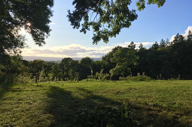
<figure class="figure figure--img figure--right">
<img src="https://c1.staticflickr.com/5/4426/37115570042_7f43df901f.jpg" alt="500 pixel wide image">
<figcaption>
A field in Herefordshire, 15 September 2017.
</figcaption>
</figure>
<p>Add a <code><figcaption><figcaption></code> under the image to include a caption.</p>
<figure class="figure figure--img">
<img src="https://c1.staticflickr.com/5/4426/37115570042_7f43df901f.jpg" alt="500 pixel wide image">
<figcaption>
A field in Herefordshire, 15 September 2017.
</figcaption>
</figure>