Patterns: Galleries
Standard
For displaying images of different sizes in 1-4 columns. As the browser narrows the number of columns reduces. The examples below all use the following HTML, only with different modifying classes on the container to change the number of colums:
<ol class="gallery">

  <li class="gallery__item">
    <h3 class="gallery__item__header">
      <a href="#">Still amazing</a>
    </h3>
    <div class="gallery__item__img">
      <a href="#">
        <img src="https://farm5.static.flickr.com/4501/37369805871_9cee379b2d_m.jpg" width="176" height="240">
      </a>
    </div>
    <div class="meta">
      <ul class="meta__inner">
        <li>12:00 on 28 Sep 2017</li>
      </ul>
    </div>
  </li>

  <li class="gallery__item">
    <h3 class="gallery__item__header">
      <a href="#">Wooden road paving</a>
    </h3>
    <div class="gallery__item__img">
      <a href="#">
        <img src="https://farm5.static.flickr.com/4361/36895096796_991d6265ab_m.jpg" width="180" height="240">
      </a>
    </div>
    <div class="meta">
      <ul class="meta__inner">
        <li>13:16 on 7 Sep 2017</li>
      </ul>
    </div>
  </li>

  <li class="gallery__item">
    <h3 class="gallery__item__header">
      <a href="#">Friday evening</a>
    </h3>
    <div class="gallery__item__img">
      <a href="#">
        <img src="https://farm5.static.flickr.com/4426/37115570042_7f43df901f_m.jpg" width="240" height="160">
      </a>
    </div>
    <div class="meta">
      <ul class="meta__inner">
        <li>19:37 on 17 Sep 2017</li>
      </ul>
    </div>
  </li>

  <li class="gallery__item">
    <h3 class="gallery__item__header">
      <a href="#">Morning!</a>
    </h3>
    <div class="gallery__item__img">
      <a href="#">
        <img src="https://farm5.static.flickr.com/4371/36872065906_708d1fbcf2_m.jpg" width="240" height="180">
      </a>
    </div>
    <div class="meta">
      <ul class="meta__inner">
        <li>08:28 on 6 Sep 2017</li>
      </ul>
    </div>
  </li>

  <li class="gallery__item">
    <h3 class="gallery__item__header">
      <a href="#">Friday afternoon</a>
    </h3>
    <div class="gallery__item__img">
      <a href="#">
        <img src="https://farm5.static.flickr.com/4351/36667775716_1a43386cd7_m.jpg" width="180" height="240">
      </a>
    </div>
    <div class="meta">
      <ul class="meta__inner">
        <li>14:25 on 21 Aug 2017</li>
      </ul>
    </div>
  </li>

  <li class="gallery__item">
    <h3 class="gallery__item__header">
      <a href="#">Sunset</a>
    </h3>
    <div class="gallery__item__img">
      <a href="#">
        <img src="https://farm5.static.flickr.com/4387/36345608586_03b79d3aea_m.jpg" width="180" height="240">
      </a>
    </div>
    <div class="meta">
      <ul class="meta__inner">
        <li>19:32 on 5 Aug 2017</li>
      </ul>
    </div>
  </li>

</ol>
2 columns (default)
By default, at wider widths, the gallery has two columns:


3 columns
Add the .gallery--3 class to the container to get three columns:
4 columns
Add the .gallery--4 class to the container to get three columns:
Large headers and descriptions
Using any of the above column layouts, the items can have larger, serifed, headings, and descriptions:
<ol class="gallery">
<li class="gallery__item">
<h3 class="gallery__item__header gallery__item__header--lg">
<a href="#">Still amazing</a>
</h3>
<div class="gallery__item__img">
<a href="#">
<img src="https://farm5.static.flickr.com/4501/37369805871_9cee379b2d_m.jpg" width="176" height="240">
</a>
</div>
<div class="gallery__item__desc">
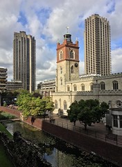
<p>This is a photo of St Giles Cripplegate Church in the Barbican, in the City of London.</p>
</div>
</li>
<li class="gallery__item">
<h3 class="gallery__item__header gallery__item__header--lg">
<a href="#">Wooden road paving</a>
</h3>
<div class="gallery__item__img">
<a href="#">
<img src="https://farm5.static.flickr.com/4361/36895096796_991d6265ab_m.jpg" width="180" height="240">
</a>
</div>
<div class="gallery__item__desc">
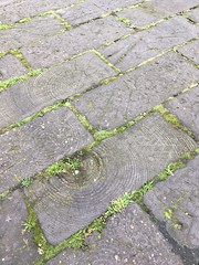
<p>Wooden paving blocks in Chequer Street, Islington. <a href="https://www.ianvisits.co.uk/blog/2015/01/10/the-time-when-londons-streets-were-paved-with-wood/">Read more about them.</a></p>
</div>
</li>
</ol>
-
Still amazing
This is a photo of St Giles Cripplegate Church in the Barbican, in the City of London.
-
Wooden road paving
Wooden paving blocks in Chequer Street, Islington. Read more about them.
Flow Gallery
The "flow" gallery is treated more like a single column or row of images, rather than a grid. Currently used for displaying links to Albums, which use a square thumbnail. For By default they wrap around into multiple rows if the browser width is narrower. Add the .gallery--flow class to the container.
Both examples below use this HTML:
<ol class="gallery gallery--flow">

  <li class="gallery__item">
    <h3 class="gallery__item__header">
      <a href="#">The Barbican</a>
    </h3>
    <div class="gallery__item__img">
      <a href="#">
        <img src="https://farm1.static.flickr.com/4/6870808_b91cb5cd7f_q.jpg" width="150" height="150">
      </a>
    </div>
    <div class="meta">
      <ul class="meta__inner">
        <li>81 photos</li>
        <li>2 videos</li>
      </ul>
    </div>
  </li>

  <li class="gallery__item">
    <h3 class="gallery__item__header">
      <a href="#">CDs with price labels</a>
    </h3>
    <div class="gallery__item__img">
      <a href="#">
        <img src="https://farm5.static.flickr.com/4399/37368291835_60e5a86a31_q.jpg" width="150" height="150">
      </a>
    </div>
    <div class="meta">
      <ul class="meta__inner">
        <li>27 photos</li>
      </ul>
    </div>
  </li>

  <li class="gallery__item">
    <h3 class="gallery__item__header">
      <a href="#">Isle of Skye, 2017</a>
    </h3>
    <div class="gallery__item__img">
      <a href="#">
        <img src="https://farm5.static.flickr.com/4248/34444945744_d787f138cd_q.jpg" width="150" height="150">
      </a>
    </div>
    <div class="meta">
      <ul class="meta__inner">
        <li>20 photos</li>
      </ul>
    </div>
  </li>

  <li class="gallery__item">
    <h3 class="gallery__item__header">
      <a href="#">USA Maps, 1963</a>
    </h3>
    <div class="gallery__item__img">
      <a href="#">
        <img src="https://farm3.static.flickr.com/2740/32841132576_18e8a41d27_q.jpg" width="150" height="150">
      </a>
    </div>
    <div class="meta">
      <ul class="meta__inner">
        <li>66 photos</li>
      </ul>
    </div>
  </li>

</ol>
In a main content column


In a sidebar
If a flow gallery is in a .grid__col--sub it’s a single column when the browser is wider: